Recovery Fest
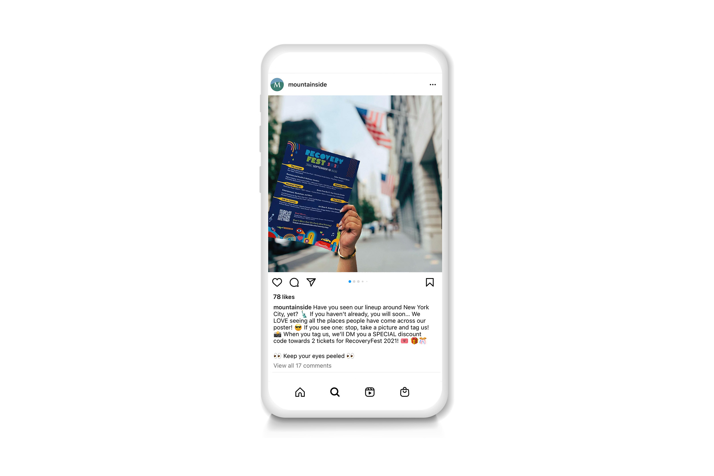
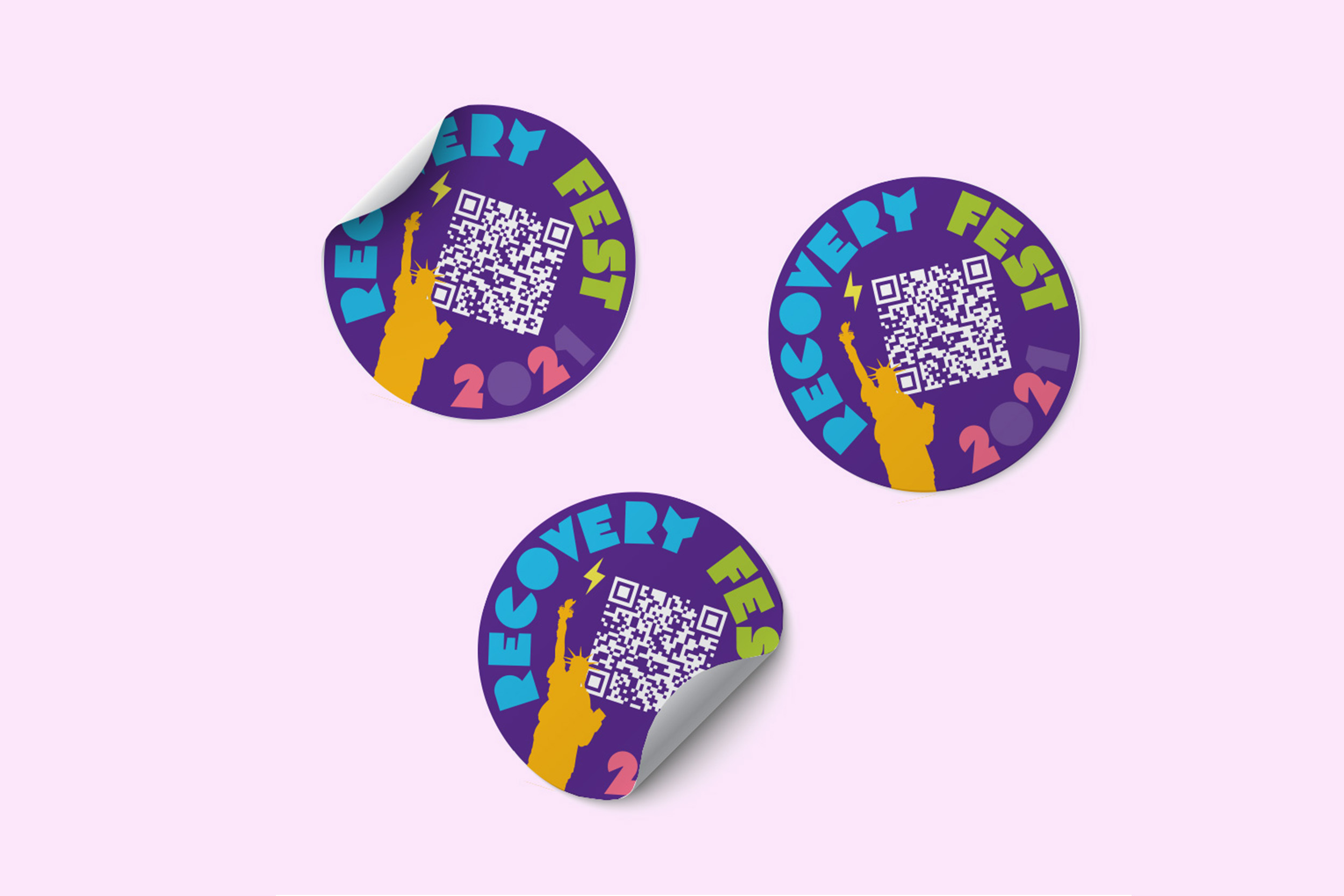
This event was created as an opportunity to bring the recovery community together through art exhibitions, live music, and wellness activities. With that in mind, I came up with fun and vibrant graphics that evoke the concepts of unity and togetherness. The deliberate choice of the color purple, the official color of recovery month, not only pays homage to its significance but also acknowledges the deep-rooted value that the recovery community attaches to this color. By using attention-grabbing vibrant colors, I aimed to evoke a sense of hope, joy, and creativity. To convey harmony and balance, I used geometric designs. My goal with the designs was to inspire the recovery community to pursue their goals and express themselves in positive and healthy ways. I also aimed to prove that recovery is not a dull or a boring process, but a vibrant and dynamic one that can open up new possibilities and perspectives. As part of this event, I took charge of designing promotional print materials, web banners, and designed giveaways, further enhancing the overall experience.


